We all experience user interface. User interfaces have different sorts. Why it is crucial to understand what user experience (UX) means and how it matters. As a developer having an understanding of how to approach UX and usability and how to approach user interface (UI) from a design perspective is crucial for a product.
What is User Experience (UX)?
Matching a user’s needs and a product’s use is an aspect of usability. A developer should grow an appreciation for UX, which affects:
• Its Functionality
• The System Organization and Structure
• Interactions and Look and Feel
• Access
Poor UX will result in people won’t use your product, building, service, or website. People with a terrible UX will not use a product even when it works and will look to return it. This will follow with people not buying your product, and worse will tell their friends not to use it.
What is User Interface (UI)?
UI is the point of human-computer interaction and communication in a device. For example, a printer or human operation is the point of interaction or communication between a computer and another entity. The information flows in one direction or two.
UI fulfills two key UX needs: Interactions and Look and Feel, and Access.
Why Do We Care About User Experience and User Interface?
 Because it matters, and there is no one User!
In 1998 Diamond Rio created Roxio, a music device that emphasized an experience similar to the Sony Walkman. The product looks to emphasized a digital experience like listening to cassettes. The user experience was around “pushing play,” and the design emphasized the Walkman design.
In 2001 Apple created the iPod, a music device designed to experience and play “mixes” – what went on the tapes. The user experience was emphasized on making playlists, acquiring tunes, and playing music. The design emphasized one thumb simple.
As a designer, I agree with the thinking of Steve Jobs when he said in an interview:
“Most people make the mistake of thinking design is what it looks like. People think it’s this veneer – that the designers are handed this box and told, ‘Make it look good!’ That’s not what we think the design is. It’s not just what it looks like and feels like. Design is how it works.”
That philosophy is what makes Apple one of the best in product design and simplicity.
What is Good Design?
Design is hard and easy to overdo. From an architect’s perspective, good design is planning, designing, and devising build environments that are functional, aesthetical, and durable. We need to design rationally for the end-user for them not to feel confused. It’s to put the end-user at the center of the universe and defines the system from that perspective.
Good design and web development is a solution that serves the users and satisfies the client. Do what the users need and want. A product that is natural to use without confusion, helping the user to avoid trouble. To produce a good design:
Understanding Human Capabilities and Preferences For User Experience and User Interface
Human Capabilities:
1. Memory
2. Attention
3. Visual and Audio Perception
4. Learning
5. Language + Communication
6. Touch
7. Ergonomics (sense of fit)
 Values and Sensibilities
1. Level of experience
2. Physical or mental capabilities and limitations
3. Cultural expectations
4. Language differences
5. Senses of style
6. Have different needs or values
Base your ideas on User-Centered Design where you needs to:
1. Identify who the users are.
2. Identify what they want to accomplish.
3. Continually assess (1) and (2).
Know Your User Roles, Responsibilities, Capabilities
1. Who are the users?
2. What are users trying to accomplish?
3. What information does the user needs to accomplish their task?
4. How easily can the user identify the information they need and the steps necessary to accomplish their tasks?
5. Is the information and product structures accessible to everyone?
6. How often will the user be using the product?
7. The product emphasizes ease of use and learning or information?
How Do We Express Design?
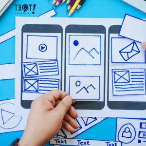
The best way is to start with paper prototypes. You can get the same design information from more effortless and cheaper to make low-fidelity prototypes from higher fidelity prototypes. Simple paper prototypes are easy to produce and maintain. Remember that you are not limited to a napkin or an 8.5 “x 11” paper.
You can also compose parts of the design on a computer at various detail levels, up to a full-fledged mockup.
Advantages
1. Fast way to mock up an interface.
2. A team can participate.
3. Allows being refined based on user feedback before implementation begins.
4. It can help to identify problems with the interface.
Disadvantages
1. Doesn’t produce any code.
2. It doesn’t demonstrate the way users interact with the interface.
3. Has more robust benefits in some situations than in others.
4. Do not find all classes of problems with an interface.
Principles For Designing User Interface
Jacob Nielsen’s has listed ten principles of UI design:
 1. MATCH THE REAL WORLD, DIRECTLY MANIPULATE OBJECTS -> The user interacts with a visual representation of data objects. The visual representation and physical interaction are important.
2. OBJECTS SUGGEST SPECIFIC ACTIONS (MANIPULATIONS) FOR USE, NATURAL MAPPING -> The physical arrangement of controls should match the arrangement of function.
3. ACTIONS SHOULD HAVE IMMEDIATE, VISIBLE EFFECTS.
4. CONSISTENCY AND STANDARDS -> Users should not have to wonder whether different words, situations, or actions mean the same thing.
5. HELP AND DOCUMENTATION -> Help should be Searchable, Context-sensitive, Task sensitive, Concrete, Short, and best of all, not needed.
6. USER CONTROL AND FREEDOM -> Users may run in trouble by using a product function by mistake and need a clear exit to leave the unwanted state without going through an extended dialogue.
7. VISIBILITY OF SYSTEM STATUS -> The product should keep users informed about what is going on through appropriate feedback within a reasonable time.
8. FLEXIBILITY AND EFFICIENCY -> Accelerators may often speed up the expert user’s interaction such that the product can cater to inexperienced and experienced users. Allow users to tailor frequent actions.
9. RECOGNITION, NOT RECALL -> The user should not remember information from one part of the dialogue to another. Instructions for the use of the system should be visible or easily retrievable whenever appropriate.
10. ERROR PREVENTION -> Even better than good error messages, a careful design prevents a problem from occurring—present users with a confirmation before committing to the action.
11. HELP USERS RECOGNIZE AND RECOVER FROM ERRORS -> Error messages should be expressed in plain language (no codes), precisely indicate the problem constructively suggest a solution. And they should be polite…
12. AESTHETIC AND MINIMALIST DESIGN -> The product should not contain irrelevant information. Irrelevant information competes with the relevant information and diminishes their relative visibility.
Can We Please Everyone?
NO!
If you put your effort into optimizing every single user experience, your product will not succeed. Digital marketing specialists know that you need to focus and prioritize specific components instead of working on them all at once. The progress of usability should be in small steps and not huge leaps.

